


The colour white is frequently thought of as “boring” or “overdone,” but the reality is, white is one of the most versatile colours we can use in interior design! We love using it for contrast, to better display an art collection, or to further amplify a homeowner’s style.
A professional interior designer knows how to use space, textures, flooring, layers, and more to help define a home’s style. Since there are so many elements to design besides simply color, even white can be used to send a message. White (also known as a neutral rather than a color) can make a space feel comforting and welcoming, sophisticated, or even intimidating. Regardless of your home style preference, you can use white to make a big impact and make your home feel like it’s an extension of you.
Using White to Augment Your Home’s Details
If you prefer natural woods, stones, and other elements in your home, white can make those details pop, and help define your space. Since white doesn’t clash with any other colors, you have a lot of flexibility when it comes to the color in your finishes, patterns, and materials. White works with anything from dark wood floors to exposed brick.
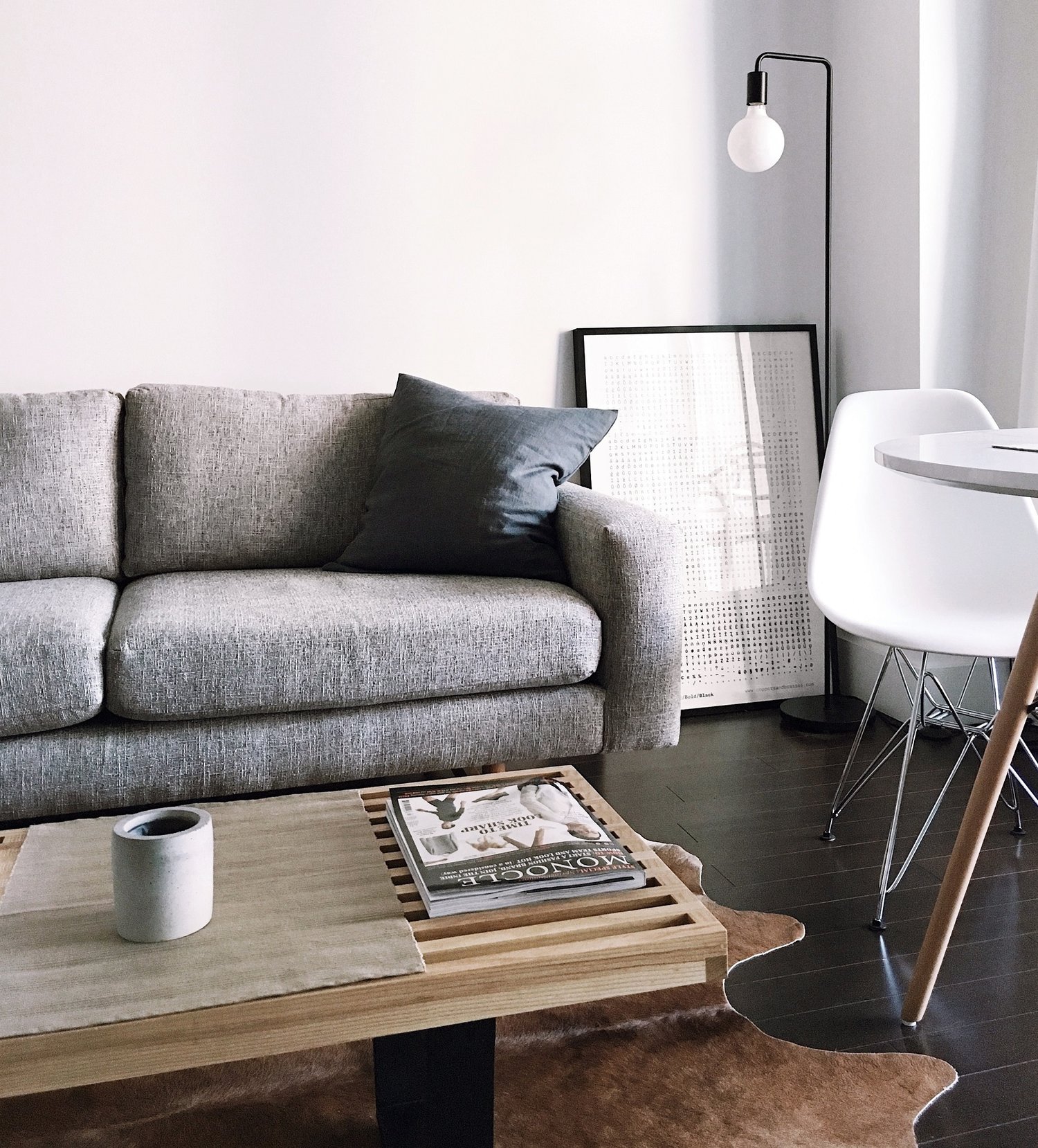
In the image below, rather than clashing with the dark floors, the white walls make them stand out and help make the room appear lighter and larger. The white chair provides a nice contrast against the espresso-colored flooring, but also fits right in with the neutral walls. This space is a great example of how white can highlight natural materials like the wooden coffee table and calfskin rug. This allows for the home’s style to really shine. It’s not in anyway overtaken by the white walls or accent pieces.
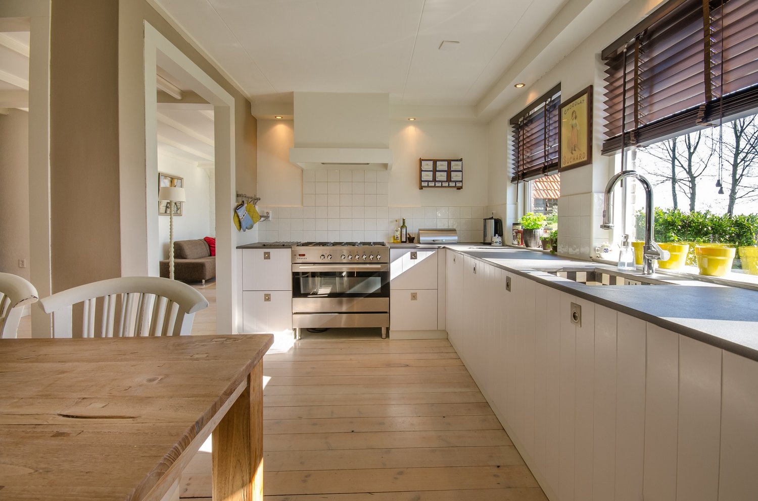
In this kitchen example, the white paint has a warmish hue and makes the maple-coloured wooden floors pop. The yellow flower pots and the brown of the window coverings complement the warm hues of the floors, cabinets and tiled wall. The tiled wall adds an interesting texture, contrasting nicely with the wooden floors and table. While there is a lot of white in this kitchen, it’s definitely not boring! We also like how this shade of white works with all the natural sunlight this room receives. This space is another great example of how white can make a homeowner’s interior design style really stand out.
Another underlooked benefit of white is how it can make ceiling beams the focal point of a space. In this new home lakehouse build, we used white on the walls and ceiling of this area, which highlights the beautiful wooden beams, contributing to the minimalistic, natural look. White is a great option for homes that have stunning landscape views. Since this lakehouse has a great view of the lake, we’re able to use white to draw attention to the outdoor surroundings as well as the rustic, minimalistic style of the space. The ceiling beams help the room appear larger and mesh well with the wide open space of the immediate outdoors. The stone fireplace adds another textural element that amplifies the wooden floors, walls, and ceiling.
White is Flexible with Multiple Colour Combinations
Depending on the elements of your interior design, white can look rigid. The reality is, however, that white is an extremely flexible color. As we discussed above, it can go with every color. If a client has a favorite color that is best used in small doses, white can really go a long way in making that happen.
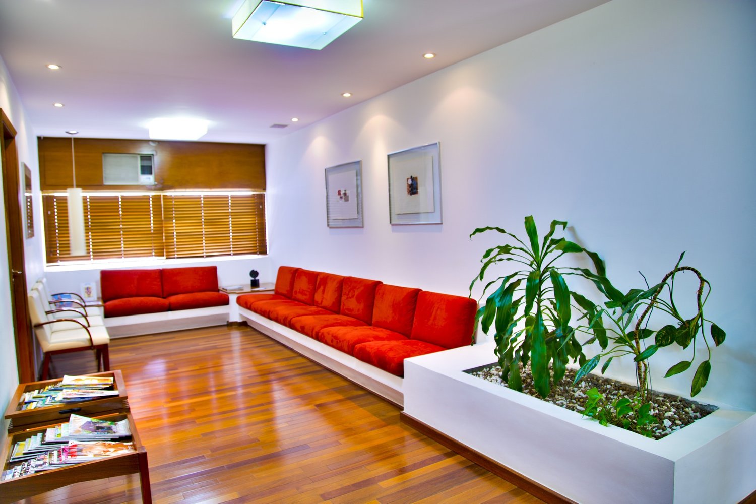
For example, orange isn’t a very popular color with many, but it definitely leaves a positive impression in this reception area design. The brilliant green plants also provide a nice contrast and help make an impact. When looking at this design, one doesn’t immediately think “white room,” but the majority of this space is white!
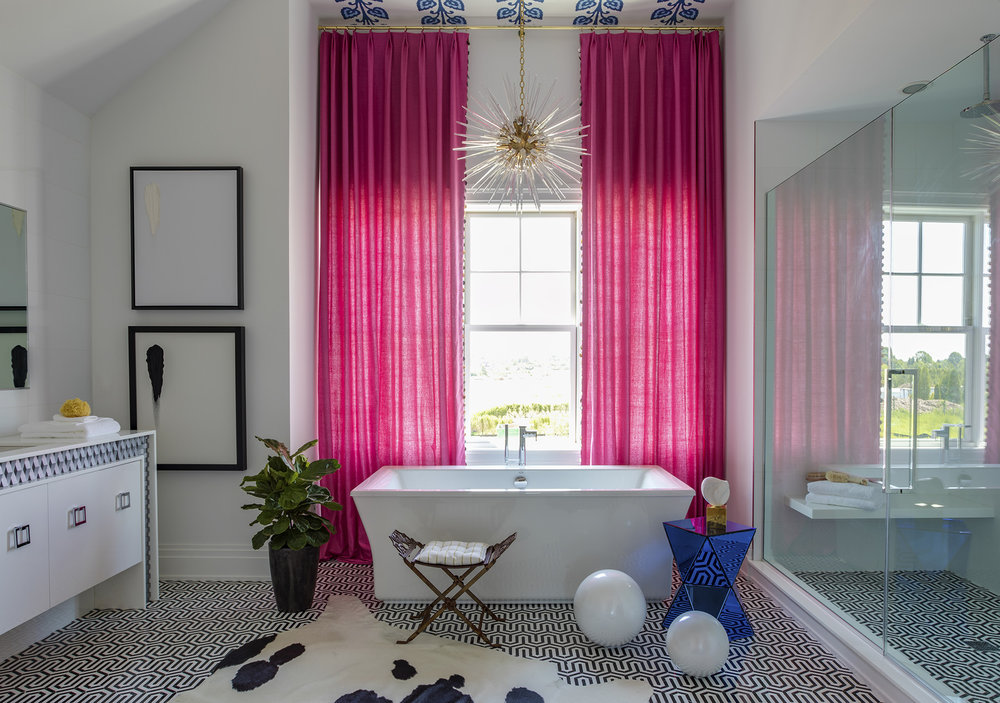
In this master bathroom, we designed for a Hamptons, New York home, there is a significant pop of pink! The white walls, ceiling, and black-and-white floor support an otherwise difficult-to-use color. And again, although the majority of this space is white, this bathroom is anything but boring or plain. It’s memorable in its use of colors including gold, pink, and blue, and it allows for a fun, unique pattern on the ceiling. Even the artwork makes significant use of white space to make an impact.
In another bathroom we designed, we used a significant amount of white, but it’s definitely not boring. This was designed for a family that wanted both a traditional and airy, spacious look. Since white works well with various metals, the hardware finishings in the lamps, faucets, and cabinetry handles really pop in this space. The light blue works well with the white, and with the emphasis on metallics, the fun-shaped light fixture is very prominent in this room. The marble floors also help to emphasize the metallics hardware in this space, and the paneling on the tub helps with the traditional look the homeowners wanted. The white is spacious, and the windows and lighting add to the airy, light feeling.
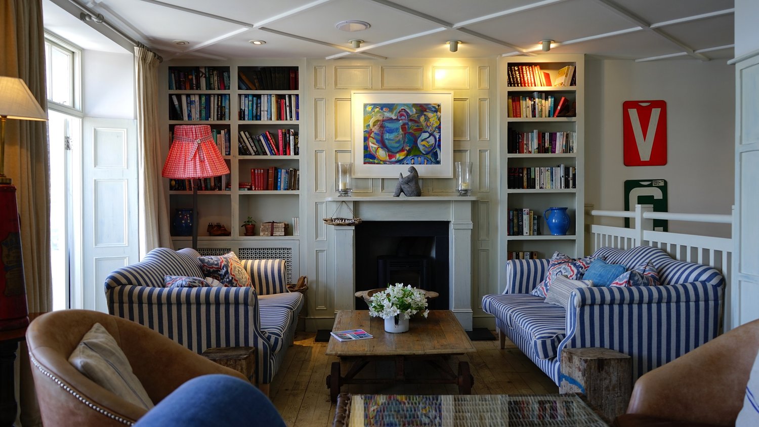
Although this living room is mostly white with wooden floors, the obvious focal point is the fun blue-and-white striped pattern on the couches. The stripes and the paneling on the ceiling and walls add an almost nautical theme to the room. Using neutrals on walls, ceiling and floors can support really fun and unique furniture, rug, and general decor options. This look simply wouldn’t be the same if the wall was the same color as the blue stripes on the furniture!
We custom-designed the beautiful kitchen seen below with a large island for a family that enjoys a vibrant pop of colour. At first glance, there is only the white walls, cabinetry, and countertops, but the kitchen opens into a colourful eating area. In this open space are lots of fun blues, yellows and greens (see photo below.) The white kitchen provides a backdrop for these colours to really shine.
As you can see from these examples, white is a versatile colour that can be used for almost any type of home style, in any room of the home, and in conjunction with any colour palette. It can be used to make a home warmer or cooler and can add spaciousness and light to even small rooms, such as a bathroom. We enjoy using white to amplify a client’s style and help them create a home that is uniquely theirs.